Yourtyres.co.uk switches to responsive web design
 Delticom’s yourtyres.co.uk site now features responsive design
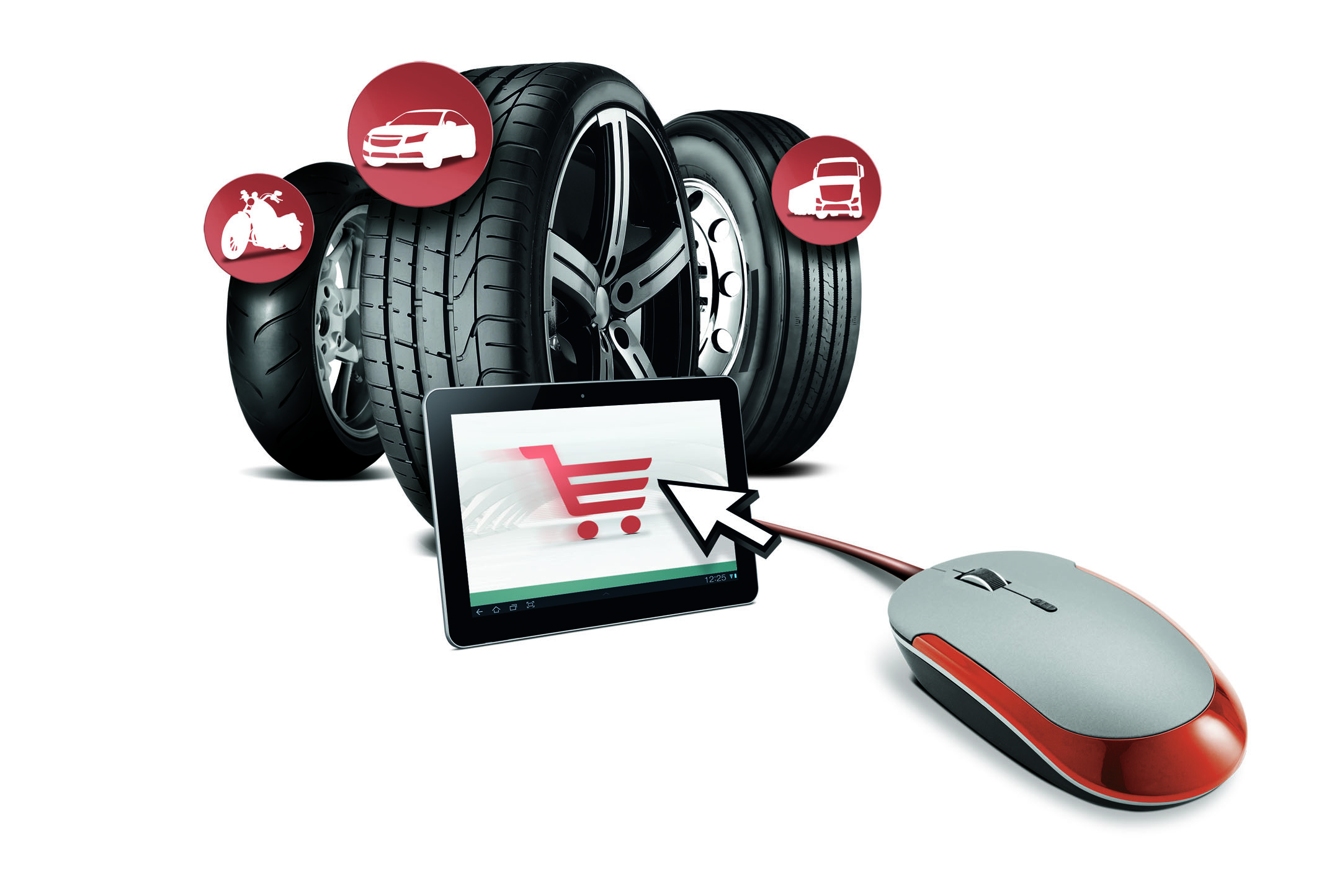
More and more people are using mobile devices to access the Internet. According to figures from statistics service StatCounter, since October 2016 smart phone and tablet access to the Internet has predominated worldwide – and the tendency is growing. Yourtyres.co.uk has adapted itself to this change in user behaviour, recently unveiling a new, modernised look: Delticom’s online shop for workshops and wholesalers has now been recreated in “responsive web design”, meaning it is now optimally displayed on mobile devices. Responsively designed web pages adapt their design to the respective screen size, so that content is still clearly identifiable even in small spaces such as smart phone screens. So even if you are accessing Yourtyres.co.uk from your smart phone, searching for car, motorbike, truck and custom tyres, complete wheels and rims, or accessories and spare parts remains easy and clear. Particularly convenient is the option to search using the manufacturer key number or model code number from the registration certificate.
“The trend towards mobile Internet use is continuing to grow – and this is also true for automotive businesses. Using smart phones and tablets simplifies many things and offers countless new opportunities, such as providing customers with advice and selecting products while standing right next to their vehicles”, says Andreas Faulstich, Head of B2B at Delticom.
“We want to make using the shop as easy and convenient for our customers as possible. This is why the mobile version of the shop offers all the same advantages and features as Yourtyres.co.uk, for example the ability to search via matchcode, item number, EAN or manufacturer ID. In addition, our free app for iOS and Android has been available since the spring, offering users who prefer tablets or smart phones particularly clear, rapid access to our range of car, truck and motorbike tyres.”


Comments