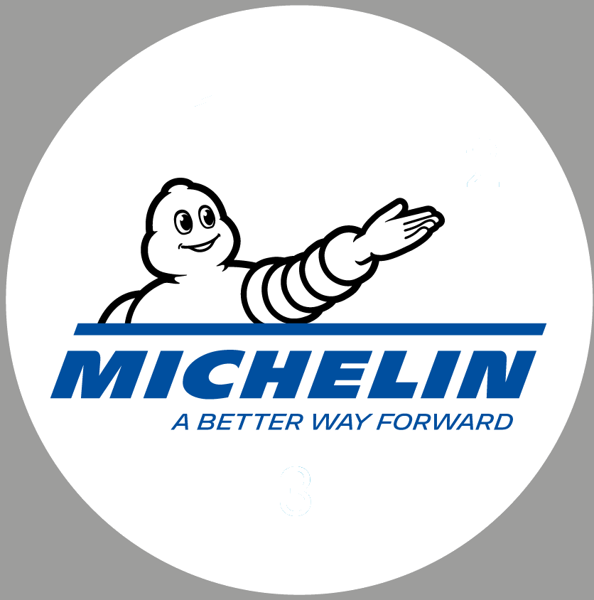
New Michelin logo
 The Michelin man, Bibendum, returns to two dimensions in his latest incarnation
Michelin has renewed its logo and visual identity. In short, Bibendum has been reconfigured as modern line drawing rather than the 3D rendering of the decade or so since 2000. At the same time the mascot has been brought together with the company’s name once again.
According to Michelin, the deployment of new activities and the multi-brand strategy promoted by the group reflect a desire to expand Michelin’s mission by “offering every solution that enhances mobility, beyond [the] core activity, which is to produce tyres”.
For over 120 years, the Michelin Man (Bibendum) has faithfully supported the group’s communication. Bibendum’s purpose is to guide customers and to serve them. Bearing in mind that Michelin is increasingly present online, the graphic design Michelin Man returns to two dimensions, which is not as heavy to download and easier to manipulate.
From a single logo to two logos
By the end of 2017, the change in this brand identity will also involve the use of two logos compared with one at present. One will be used for the group brand and the other will embody the Michelin brand’s sales proposition of tyres, services, solutions and the Michelin Experience. The latter is scheduled to be unveiled a few weeks after the first.
The new trademark, called “Bib in the World” is expressed in a new advertising campaign on the theme of “Michelin takes action.”


Comments